Common Mobile UX Mistakes I See in Almost Every Project

Dinko Marinac

Introduction
Every time I start a new project, the one of the first things I have do is review the designs.
And almost every time, I notice the same pattern: designs that technically work on mobile, but were clearly conceived with desktop thinking. Web patterns are resized, rearranged, and stacked vertically, but the underlying assumptions remain the same.
The problem is not visual quality.
The problem is that mobile is a fundamentally different interaction model.
On mobile:
- Screen real estate is limited and vertical
- Scroll areas cannot collide
- People are using fingers and some parts of the screen are harder to reach
Once you realize that, certain design decisions become obviously problematic. Yet they keep showing up in project after project.
Below are four recurring issues I encounter when reviewing mobile designs, and why they cause friction in real-world use.
Dropdowns
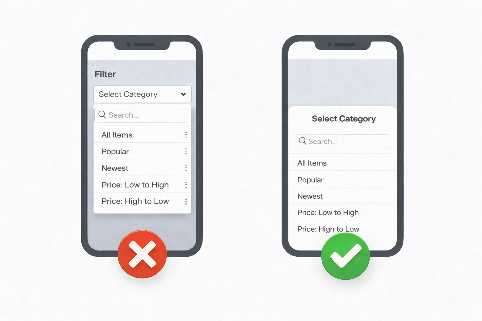
Dropdowns are one of the most common examples of a web pattern that does not translate well to mobile.
On desktop, dropdowns are efficient. They take little space, allow precise selection, and work well with a mouse. On mobile, they introduce several usability issues at once.
Large dropdowns often extend beyond the visible area, hiding options. They frequently create nested scrolling, where the dropdown scrolls independently from the page, making it easy to scroll the wrong element. When dropdowns are used for filtering, they rarely support search well. And when the keyboard appears, it often covers part of the list or any search input entirely.
All of this adds friction to what should be a simple interaction.
A more mobile-friendly alternative is a bottom sheet. Bottom sheets use the full width of the screen, avoid nested scrolling, integrate cleanly with the keyboard, and support longer lists and search naturally.
This is not a new pattern. It is simply a more appropriate one for touch-based interfaces.
Modals
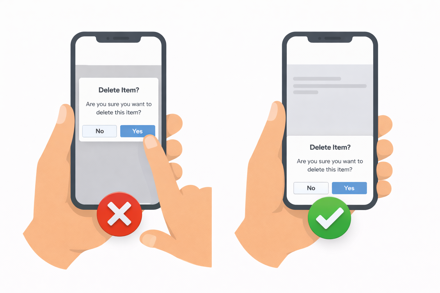
Centered modals are another pattern that often carries over from web to mobile without reconsideration.
On modern phones, screens are tall and devices are commonly used with one hand. The natural resting position of the thumb is in the lower half of the screen. Centered modals place primary actions outside of that comfortable reach zone.
As a result, users frequently need to adjust their grip or use a second hand just to confirm or dismiss a modal. This might seem like a small inconvenience, but repeated many times, it adds noticeable friction to the experience.
Bottom-aligned surfaces, such as bottom sheets, align better with how people actually hold their phones. They keep primary actions within easy reach and preserve a sense of spatial continuity instead of fully interrupting the interface.
Modals are not inherently wrong, but they are often used in situations where a mobile-native pattern would be more ergonomic.
Dashboards and Webshops
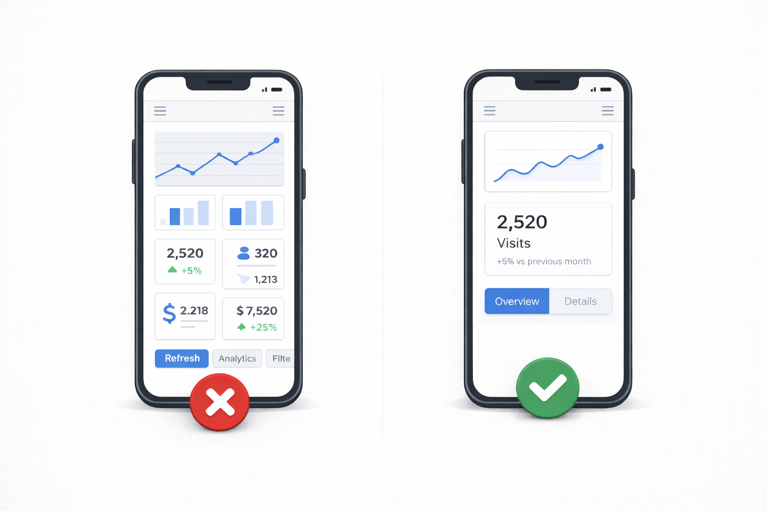
Desktop dashboards are designed for overview. They allow users to scan multiple data points at once and compare information side by side.
Mobile dashboards cannot serve the same purpose in the same way.
With limited screen space and a vertical layout, trying to display multiple charts, metrics, and secondary information at once quickly becomes overwhelming. Important information gets pushed down, and users lose a clear sense of what matters most.
Effective mobile dashboards prioritize a single primary metric or insight at the top of the screen, followed by secondary information that can be explored if needed.
The same principle applies to mobile webshops. The product, its value, and the primary call to action must be immediately visible. Additional details can come later.
On mobile, users value focus, not from completeness.
Forms
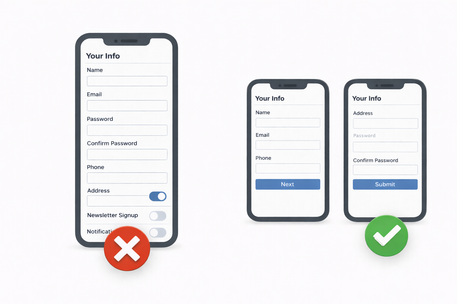
Forms are one of the most common sources of frustration in mobile applications.
Many mobile forms are direct adaptations of desktop forms, with all fields displayed at once. On a phone, this results in long scrolling sessions, frequent keyboard interruptions, and users losing track of where they are in the process.
Common issues include too many visible fields, lack of logical grouping, incorrect keyboard types, and missing defaults. Each of these increases cognitive load and raises the likelihood that a user will abandon the form entirely.
Mobile-friendly forms are often segmented into smaller steps, reveal fields progressively, and make heavy use of autofill, sensible defaults, and appropriate keyboard configurations.
By reducing the perceived effort, they significantly improve completion rates.
Closing Thoughts
None of these issues are about aesthetics or personal taste.
They stem from ignoring the realities of mobile phone. Fingers are less precise than cursors. Screens are smaller and vertically constrained.
Designing for mobile is not about shrinking interfaces. It is about rethinking interactions to match how people actually use their devices.
Once you build and ship enough mobile products, these problems become hard to ignore. And once you notice them, you start seeing them everywhere.
If you have found this useful, make sure to like and follow for more content like this. To know when the new articles are coming out, follow me on Twitter and LinkedIn.