Styling your Dart Jaspr website with Tailwind CSS and DaisyUI

Dinko Marinac

Introduction
If you are a Flutter developer like me, you know that one of the main pain points for Flutter web is SEO. The solution to that is Jaspr, a Dart web framework that looks and feels like Flutter but renders normal HTML/CSS like React.
The key difference with Flutter lies in the usage of CSS. Mobile developers are not very used to this type of styling. Tailwind CSS has emerged as a leader in the CSS libraries space, offering a pragmatic approach to styling websites without sacrificing flexibility or design freedom.
However, this comes with a steep learning curve.
Luckily, we have DaisyUI, a component library built on top of Tailwind CSS, providing ready-made components and a variety of themes. It significantly simplifies the process of creating beautiful UI elements.
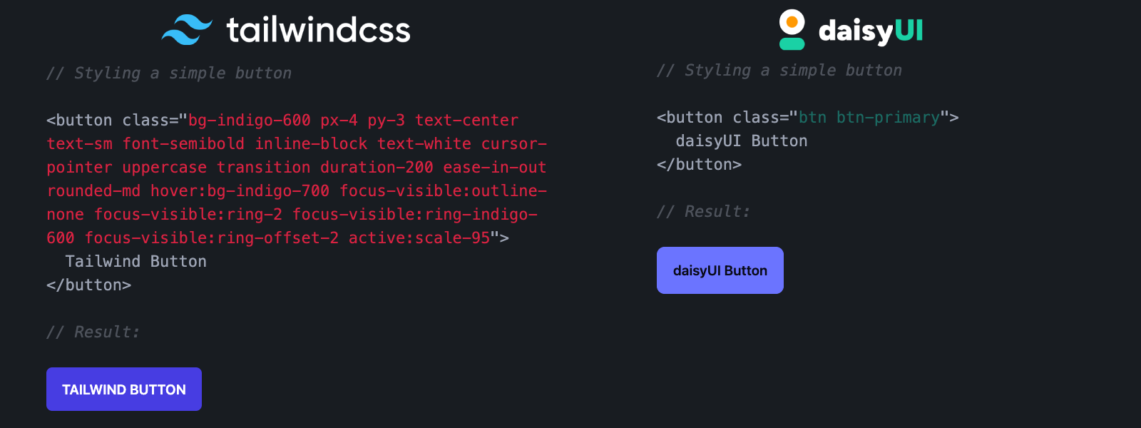
For instance, compare a basic button styled with Tailwind CSS versus DaisyUI:

DaisyUI includes 28 themes, allowing for extensive customization. Even Marc Louvion, author of ShipFast, is a big fan.
In this post, we’ll explore how to integrate these libraries into your Jaspr project to create and elevate your styling game to the next level.
To get started quickly, you can check out the quickstart repo on GitHub.
Tailwind Integration
Integrating Tailwind CSS into your Jaspr project is straightforward. Follow these steps to get up and running:
-
Install Tailwind:
First, you’ll need to install Tailwind CSS. Open your terminal and run the following command:
npm install -g tailwindcssFor versions 0.1.0 and 0.1.1 of Jaspr, this installation is required. If you’re using version 0.2.0, follow the instructions here.
-
Jaspr Integration:
Add the integration package
jaspr_tailwindas a dev dependency to your Jaspr project using Dart’s package manager:dev_dependencies: jaspr_tailwind: ^0.1.1 -
Setup Stylesheet:
After installing Tailwind, you need to set up the stylesheet in your project. Create a
styles.tw.cssfile in your project’swebfolder with the following content:@tailwind base; @tailwind components; @tailwind utilities;Next, link this stylesheet in your
index.html:<link href="/assets/styles.tw.css" rel="stylesheet">If you are using
@clientor server Jaspr setup, link it in your main Dart file (lib/main.dart):void main() { runApp(Document( title: 'My Tailwind Site', head: [ link(href: 'styles.css', rel: 'stylesheet'), ], body: App(), )); }
DaisyUI Integration
With Tailwind CSS integrated, adding DaisyUI is the next step.
-
Install DaisyUI:
Install DaisyUI by running the following command:
npm i -D daisyui@latest -
Configure Tailwind to use DaisyUI:
Create a
tailwind.config.jsfile in the root folder of your project. Add DaisyUI to the Tailwind plugins in this configuration file:/** @type {import('tailwindcss').Config} */ module.exports = { content: [], theme: { extend: {}, }, daisyui: { themes: [ "light", "dark", ], }, plugins: [require("daisyui")], };This setup will enable the standard light and dark themes.
If your integration is not working, refer to this guide. The most common issue is missing content configuration.
Colors & Theming
Tailwind CSS provides an extensive palette of colors that you can use to customize your website. With DaisyUI, you can easily adjust these colors to match your desired theme.
DaisyUI uses semantic coloring, which means that colors are named according to their usage/function. It’s the same thing MaterialUI does.
There are 4 base usage colors: primary, secondary, accent, and neutral. Each of them also has a -content counterpart, which is typically used to provide contrast to text and icons on the background using the base color.
Additionally, there are also 4 state colors: info, success, warning, and error, used for displaying various information and state to the user, and a base color group, usually used for backgrounds.
Using this styling system enables you to quickly change colors and iterate on themes, in the same way ThemeData does that in Flutter.
DaisyUI comes with 28 pre-built themes, making it simple to change the overall look and feel of your site. You can customize themes or create your own using the DaisyUI Theme Generator.
Themes are added and modified in the tailwind.config.js file. Make sure to run jaspr clean and jaspr serve after changing the theme configuration to ensure that Jaspr has the latest CSS configuration available.
Examples
DaisyUI and Tailwind are meant to be used together. Let’s style a primary button with a trailing icon that moves to the right when the button is hovered.
The basic primary button looks like this:
button(classes: "btn btn-primary",[text("Let's talk")], onClick: () {},)Classes btn and btn-primary shape the button and give it the primary color. Let’s add a right arrow next to the text with a small margin:
button(
    classes: "btn btn-primary",
    [
      text("Let's talk"),
      i(
          classes:
              "fa-solid fa-arrow-right ml-2",
          [])
    ],
    onClick: () {}),
Finally, let’s make the arrow move to the right when the button is hovered:
button(
    classes: "group btn btn-primary px-8",
    [
      text("Let's talk"),
      i(
          classes:
              "fa-solid fa-arrow-right ml-2 ease-in-out duration-300 group-hover:translate-x-1",
          [])
    ],
    onClick: () {}),
The result will look something like this:

Useful Links
Here are some resources to help you further customize and troubleshoot your setup:
-
DaisyUI FAQ: Learn how to solve the most common DaisyUI issues.
-
Daisy UI Theme Docs: Learn how to customize DaisyUI themes.
-
Daisy UI Color Docs: Learn how to customize DaisyUI colors.
-
Daisy UI Config Docs: Learn how to customize DaisyUI configuration.
-
Daisy UI Theme Generator: Customize and generate themes for DaisyUI to match your project’s aesthetics.
-
Stackblitz: Test DaisyUI theme changes in real time.
Conclusion
Integrating Tailwind CSS and DaisyUI with your Jaspr project opens up a world of possibilities for creating stunning, responsive websites. With the utility-first approach of Tailwind and the pre-built components of DaisyUI, you can streamline your development process and focus on building beautiful, functional web applications.
If you have found this useful, make sure to like and follow for more content like this. To know when the new articles are coming out, follow me on Twitter or LinkedIn.
Until next time, happy coding!